Why the user experience and a working product are important and f*ck perfect on everything else.

How complicated it is to send a package internationally.
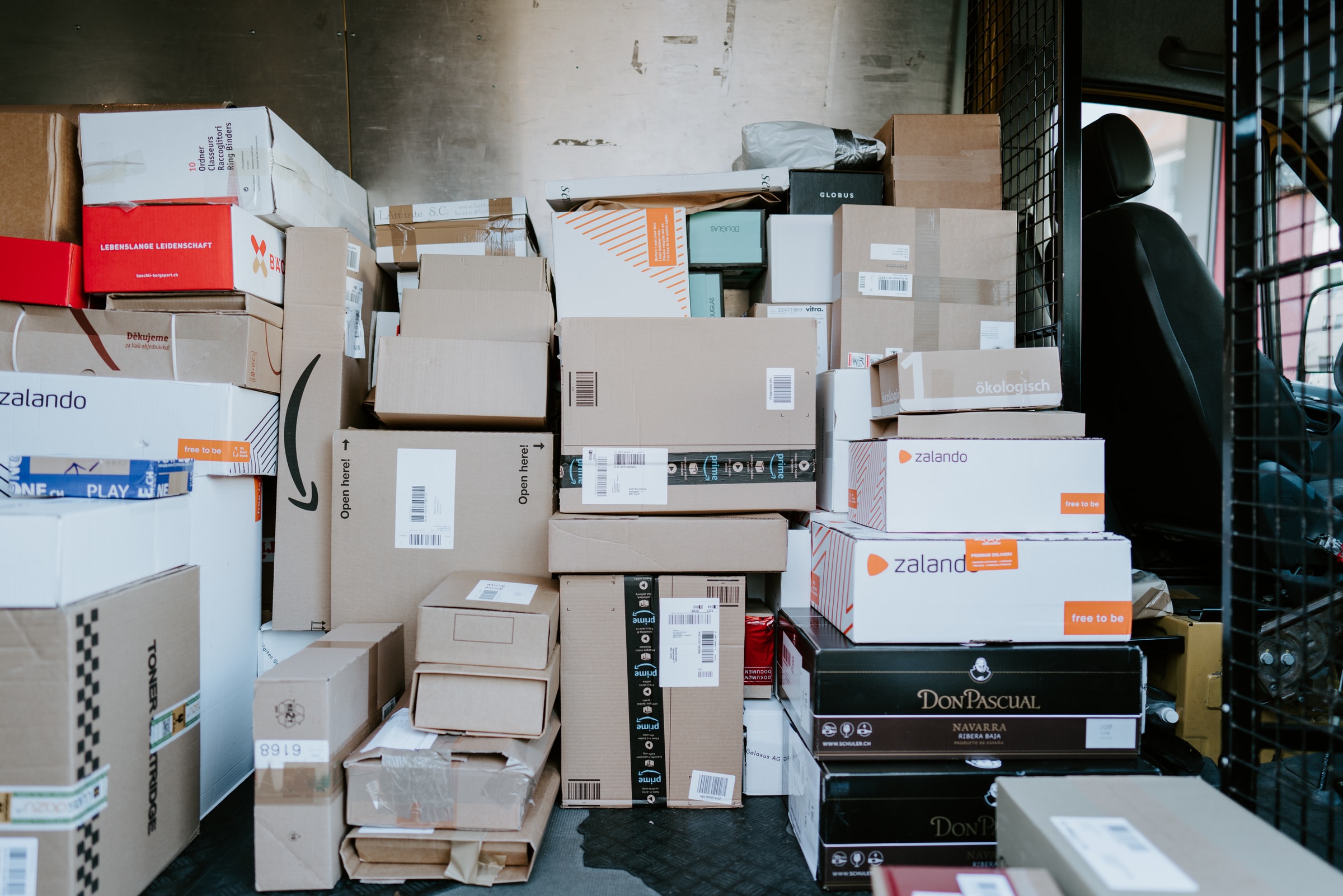
"Shit" I said yesterday when I wanted to send a package internationally. In all honesty, I've really never had to send a package internationally as a regular Joe, and it presented me with unforeseen challenges.The task is relatively simple: find a sender with insurance, fill out everything, print it out, stick it on the package, have it picked up and wait for the delivery notification. So we know this process from Germany, which has already been iterated 100 times. And it runs like clockwork. So it is assumed that the procedure for sending an international package is also the same or similar. Well, assumptions are nice in and of themselves, but the reality is different.
In reality, there is initially no direct information on international insurance companies. DHL, for example, offers a perfect check-out process and after a long search you will also find information about insurance, but there is no option to book additional insurance in the check-out process. And what I think is even worse is the fact that DHL has a subpage with information about the insurance companies, but no link in the online shop. Even if I missed it, it's a clear UI/UX fail and the product doesn't live up to its purpose. But the game goes on: With UPS you are confronted with all possible shipping options (you have to be a professional to know them) but do not calculate prices in the "Price Calculator" - you get a price only after you have filled out a very long form, or if you even get that far! Because in the middle of filling it out, I chose the option that the goods have a battery. And bang, it doesn't go any further, you are only directed to an information page where it says that you have to choose a different shipping method. Wow, thanks for taking 10 minutes of my time filling in other info, and putting one crucial piece of information somewhere in the middle. Similar game at FedEx: no prices but lots of blah blah how awesome they are. Yes, they must feel that way, after all they have the largest fleet of aircraft in the world. you are only directed to an information page where it says that you have to choose a different shipping method. Wow, thanks for taking 10 minutes of my time filling in other info, and putting one crucial piece of information somewhere in the middle. Similar game at FedEx: no prices but lots of blah blah how awesome they are. Yes, they must feel that way, after all they have the largest fleet of aircraft in the world. you are only directed to an information page where it says that you have to choose a different shipping method. Wow, thanks for taking 10 minutes of my time filling in other info, and putting one crucial piece of information somewhere in the middle. Similar game at FedEx: no prices but lots of blah blah how awesome they are. Yes, they must feel that way, after all they have the largest fleet of aircraft in the world.
In principle one can live with bugs, but one cannot reduce the user experience to a peasant level,
not in the age of ubiquitous information and possibilities. And dear logisticians: if you offer
services for the consumer, then offer a validated user journey based on the latest UI/UX
standards, which even the biggest idiot can understand and use.
In 2020, I couldn't imagine that shipping a package could be so complex for an outsider. And the
complexity consists above all in the jumble of possibilities and the lack of transparency. The
providers' websites don't really help me as a user, they only complicate the process and steal
irreplaceable time. If Google were to send out packages, it would offer a single search line, where
you just swipe a few keywords and the system behind the scenes would find the perfect deal. It is
"not" soooo complicated to start a clean and simple way and then to offer further filters & setting
options: Send "Radio" > Select country > Enter package size > Insurance yes/no > Express or
normal > Fill out customs form > Pay & print label. Finished.
But it's not that bad: if you're looking, you'll find what you're looking for, and apparently the makers of
Jumingo saw the problems described above a long time ago and have their own solution / platform
implemented: the portal offers a very quick introduction to price calculation and configuration,
just as it should be: simple and uncomplicated. However, the portal was also unable to gain my
trust when it turned out that, despite additional insurance, they do not insure computers, mobile
phones and the like. Too bad.
Can someone please tell me why world-renowned corporations can't get such a simple user
interface up and running? And this is exactly where there is no f*ck perfect, and no statement like
80% is better than 100%. This is about the fine-tuning of a product that is on the market and was
made for users. It's about further investments and iterations in development, customer centricity
and a usability experience. We all know that the larger a corporation is, the more complex even the
smallest processes become and even a Corona app can cost German taxpayers 20 million euros.
€20 million for which functionality? Ok, that's another topic, maybe we'll tackle it in the near
future... Back to experience and product development.
Conversely, it means that due to the size and complexity of large corporations, small companies
have the opportunity to dock and make money with smarter ideas and help the biggest dumbs
out there. Kind of stupid, isn't it?


